
Designing a User Experience for Tailored Digital Payments
Product owners
Technique Leader
SOA Analyst
Front End /Back End Developers.
Full-Stack-Marketer
Designer Leader
UX Designer: Facilitated Workshops, created User flows, Wireframes, and prototypes, and aligned the cross-functional team.
User Researcher: Conducted surveys of users, analyzed, and delivered results of insights.
Context
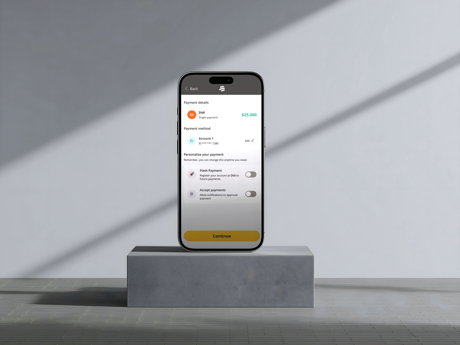
Bancolombia, the largest bank in Colombia, was among the first to implement new ways to generate personalized payments. This enables real-time payments across multiple banks and allows users to share account access with third parties, streamlining transactions and offering personalized payment options.
Design Challenge
In a daily meeting, our Product Owner said, 'I want to identify new features for payment initiation. I have ideas but struggle to define and prioritize them for a successful roadmap.' The team, including myself, had many uncertainties about the project's future.
However, this leads us to ask...
“How might we to identify and priorate new features based on User needs to enhance business goals?”

First of all, the agile and resilient process
Given this context, I wondered: How might we identify and prioritize new features based on user needs to drive business goals?
This led me to the Kano Model, which helps assess the perceived value of product features. While I had the method, I still needed the features and a process. Initially, I set up a UX workflow to address this challenge. However, it's worth pointing out that the process had to pivot over time due to the VUCA environment. As a result, we adapted wisely, combining the most effective elements from various methodologies to tackle the challenge. Here’s how the process unfolded.

The proactive approach
The first step was aligning with key stakeholders to understand expectations and business goals, ensuring an effective presentation and securing the Product Owner's support for implementing the Kano Model to help the team tackle the challenge.

Prepare the tools to involve cross-functional teams
Designed and refined workshops to engage stakeholders in solving the challenge.
Gathered user needs, financial habits, and pain points from previous research to create user personas to highlight and help stakeholders empathize with users’ payment challenges.
This research is not covered in this case study, but it added important context—and I’d be happy to walk you through it in person.
Leveraged the SCAMPER method to facilitate expansive brainstorming sessions, enabling divergent thinking and generating innovative solutions aligned with user needs.
Converged and prioritized high-value ideas through collaborative voting to prepare for user validation.

From needs, paints fears to come up tailor features
Main Features to validate based on workshop results

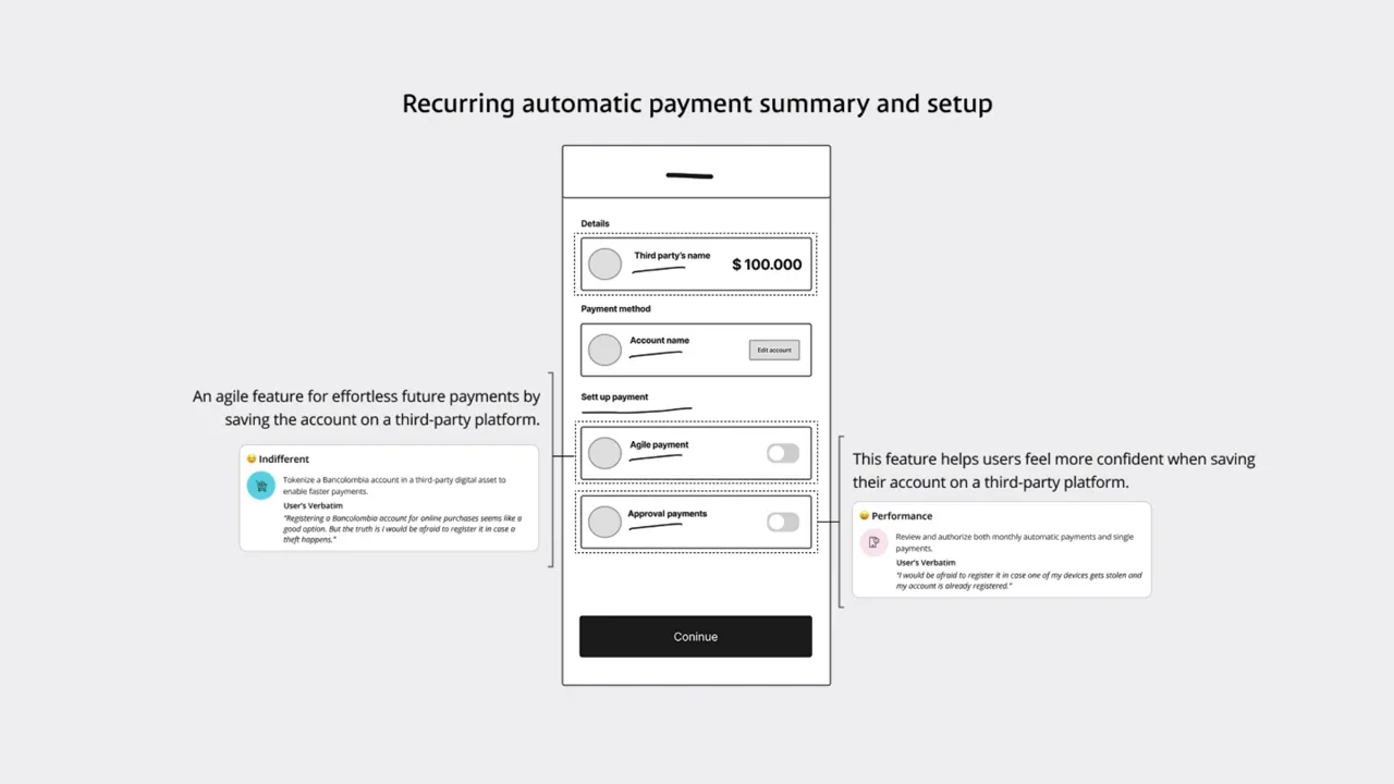
From Kano model Survey validation to categorize features based on real user preference
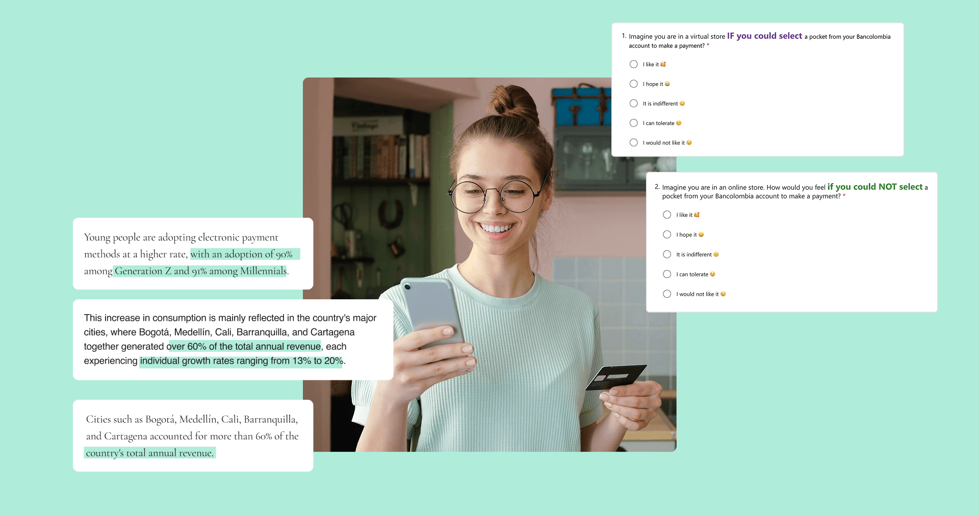
The Kano Survey Model gathers user feedback using paired Functional and Dysfunctional questions for each feature. Responses are then mapped to Kano categories (Must-Have, Performance, Delighter, Indifferent).
At the end of this question, we asked two additional open-ended questions to gather qualitative insights into users' opinions and feelings about these features.
Segmentation study
Young adults aged 22 to 32 located in the main cities of the country (Bogotá, Medellín, Cali, Barranquilla, and Cartagena), a medium to high frequency in digital payments and purchases as part of their daily routine.
Sources extracted from:
The Global State of Digital Payments and Fintech
The Colombian Fintechs
Research Outcomes
Role model features based on user’s needs
A meaningful percentage of users are enthusiastic about the new features, appreciating the ease of making payments—not only for one-time transactions but also for managing recurring monthly obligations.

Transform ideas to conceptual role model concept
Key User Flows
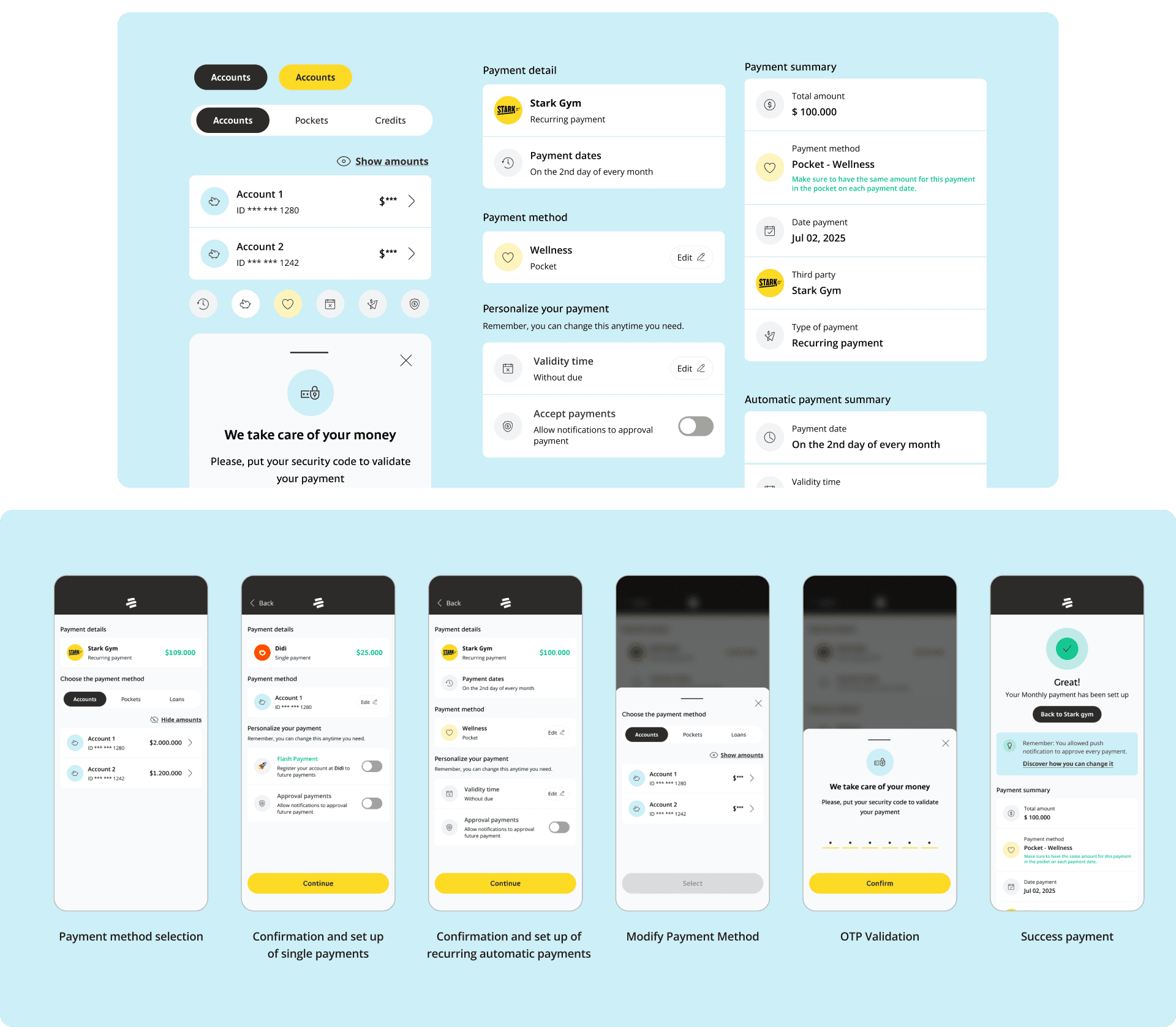
Focused on designing a user flow and wireframes that strategically segments key tasks—such as choosing payment methods, payment confirmation, and OTP verification into distinct stages it also includes all features validated previously. By applying behavioral science principles, such as progressive disclosure and cognitive load management, we minimize decision fatigue and enhance user focus. This structured approach ensures seamless task completion while maintaining engagement and reducing cognitive strain.

Wireframes Iteration
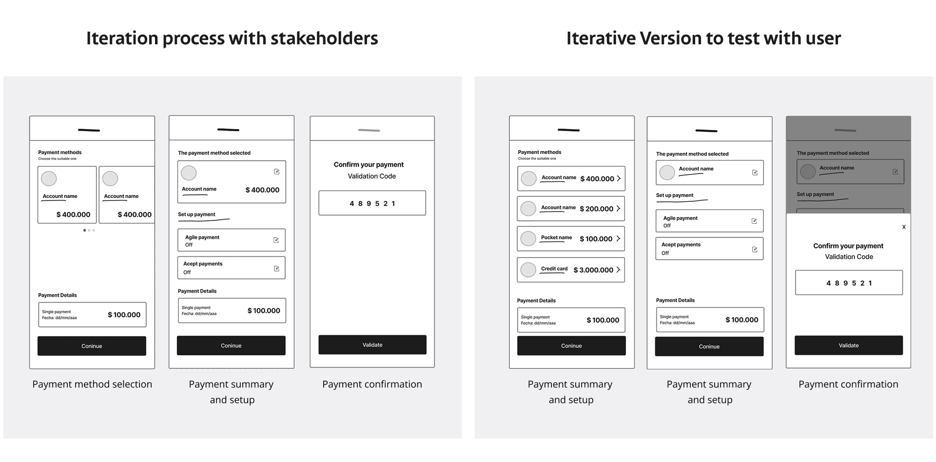
I facilitated two feedback sessions with key stakeholders — including the Product Owner, SOA Analyst, Front-End and Back-End Developers, and the UI Designer — to inform critical design iterations. Drawing on behavioral science principles such as cognitive load reduction, attention hierarchy, and task continuity, we agreed on the following improvements to apply to wireframes and test them with users:
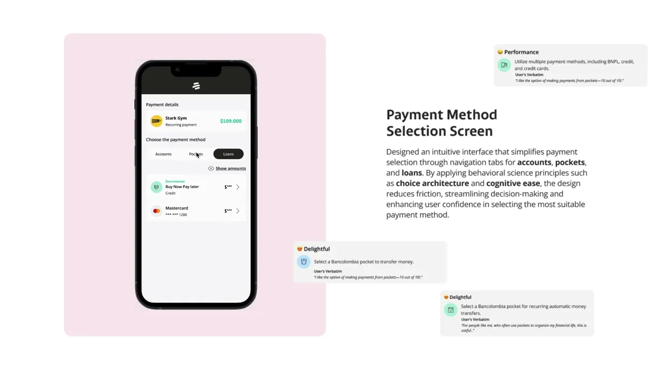
Present all payment methods on a single screen to minimize cognitive effort and streamline user decision-making. By reducing the need for additional interactions, we support quicker choices and lower the risk of friction or abandonment.
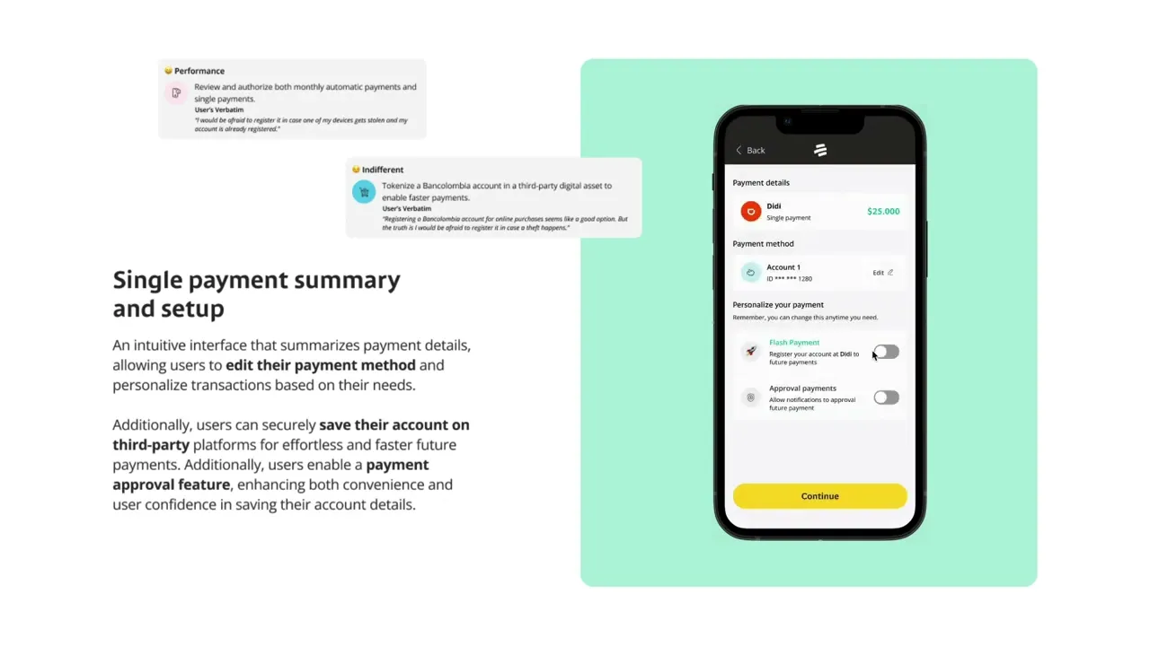
Reduce the visual hierarchy of the selected payment method in the summary screen, as it is not the primary task at this stage. This shift helps direct user attention toward more critical actions, following the principle of visual prioritization.
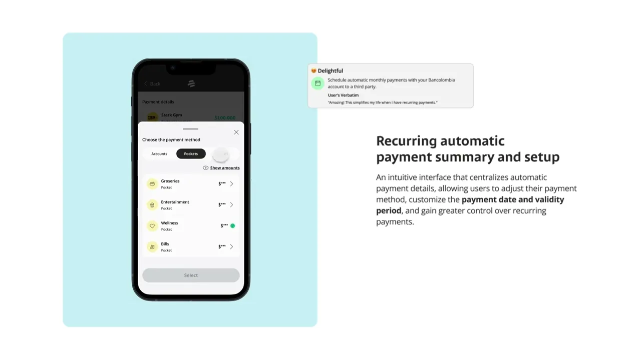
Avoid adding a separate confirmation screen for payment. Instead, we agreed to embed the confirmation step within a modal overlay. This approach maintains the user’s context, reduces perceived effort, and supports a smoother experience by avoiding context switching — a common source of user fatigue.
Validate interface with users

Key users' feedback to iterate
Users expressed the need to clearly differentiate between payment methods, as the variety of options required extra effort to distinguish among them.
Several users did not understand the concept of "accept payments" within the payment setup section, indicating a gap in terminology or context clarity.
Users reported that the information architecture was unclear—they expected to see payment details first, but were instead presented with payment method options, which disrupted their workflow.
Despite strong quantitative results (84.6% success rate and 4.4 CES), user feedback exposed hidden friction points leading us to prioritize qualitative insights to guide the next iteration.

Iterating base on the key insights
I Focused in iterate wireframes by applying behavioral science principles, such as progressive disclosure and cognitive load management, we minimize decision fatigue and enhance user focus. This structured approach ensures seamless task completion while maintaining engagement and
reducing cognitive strain.
Translating feature concepts to wireflows
Designed wireflows to translate the key features of the role-model product concept into a cohesive user journey, integrating them according to payment types. This deliverable was instrumental in the subsequent stakeholder workshop, where we prioritized features and assessed implementation efforts

The value of wireflows, and research in prioritizing a successful roadmap
After defining the main user flows and wireframes, I proposed a methodology for the Product Owner to lead a workshop aimed at shaping a successful roadmap. This approach considered not only technical feasibility and user-perceived value but also business impact. The goal was to strategically prioritize features and ensure continuous value delivery to users across multiple releases.
How did we lead the workshop?
Ice breaker to create a powerful fluency environment.
Shared the user flows and wireframes with cross-functional teams
This helped us to align perspectives and facilitate the development of an efficient workshop.
Explained and developed the methodology to measure implementation effort and business impact, ensuring informed
decision-making for feature prioritization.
This method added value by helping teams internalize the impact on user experience, business value, and the effort required, enabling more strategic decision-making.

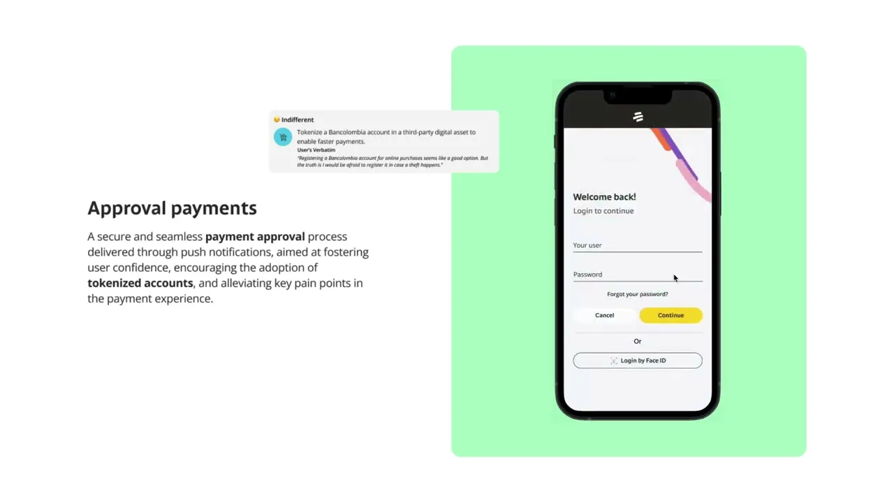
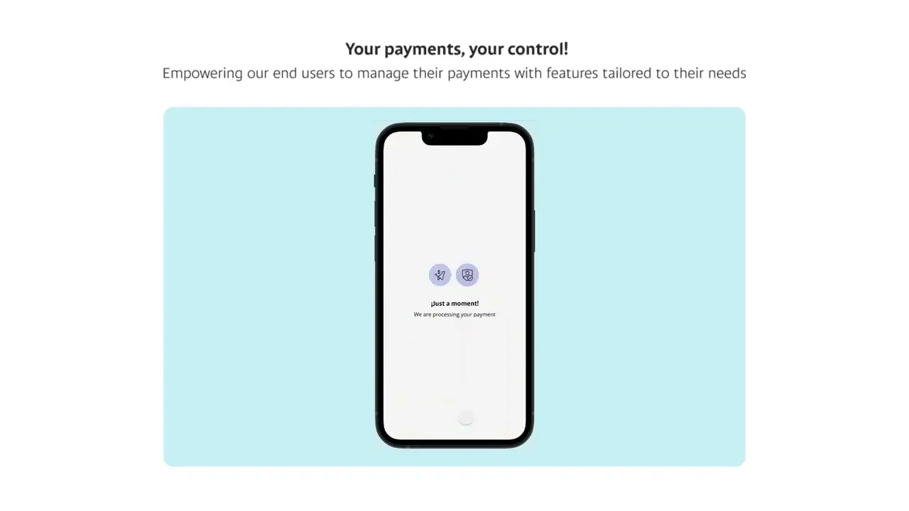
After defining scopes and releases, I focused my efforts on creating high-fidelity prototypes.
In this phase, I used flexible, adaptable, and reusable design system components to ensure easy implementation and a scalable,
modular interface.
Design Handoff
Came up with a strategy to maintain an assertive communication between cross-functional teams and design to align the expectations of the roadmap and next iterative phases of the product

Reducing stakeholder uncertainty through design not only mitigates risk and supports informed business decisions but also reinforces the strategic value of design. It remains one of the most effective ways to demonstrate design’s impact on business outcomes.
I’ve learned that the best UX designers are often found within our cross-functional teams. Involving them in addressing user needs fosters creativity, collaboration, and shared ownership producing more impactful solutions than working in isolation.
UX designers should focus on extracting the most valuable elements from design methodologies and adapting them to each project’s context, rather than rigidly applying entire frameworks. This agile mindset drives greater efficiency and relevance.
Design teams can empower others to make user-centered decisions by maintaining a close partnership with key stakeholders enabling strategic planning aligned with user needs and the long-term vision of the project.