
Digital Platform for Roommate Matching and Campus Proximity
Product manager
Marketing Team
Full-stak Developer
CEO & COO
UX Designer: Designed Information architecture through User flows, Sitemaps, and Wireframes.
UX Researcher: Conducted usability testing and user interviews, analyzed insights, and developed user personas.
UI Designer: Built scalable components and high-fidelity prototypes using Atomic Design framework.

Context and challenge
Most of Colombia's universities are located in Bogotá, which is why many people who live in towns fairly close to Bogotá travel or look for a place to live in the capital.
In some of these towns, the trip is a 3- to 4-hour round trip. Being in turn a daily money expense between $13,000 and $17,000 Colombian pesos, and a student could spend an average of $340.000 and $520.000 monthly. On the other hand, it also represents time traveling, which can be invested in rest and being able to do university work without leaving aside the physical wear and tear of the trip.
Provide the user with a way to find and rent an affordable space to share with a roommate and be close to their university.
Provide the user with proximity and access to services that they may need so that they can reach the city in a better location.

For this we define Design Thinking as a design process

Empathize with users
In the first stage of the project, I conducted a small secondary investigation was also carried out to understand the context and have a first approximation for which users the product would be built.
Likewise, after this, we focus on validating the hypothesis (proto personas) of the future users of the product and being able to understand the problems and needs. For this, it was decided to do surveys and interviews.
Insights from secondary research
Given the research, the niche will be university students who live on the outskirts of the city of Bogotá.
Because of this, it usually takes 3 hours a day traveling, and when there are traffic jams perhaps a little longer; this is why they decide to look for cheap rooms to share with people with whom they can get along well.
Young people are looking for a tasteful apartment at a good price that is accessible to work or university.

User personas identified
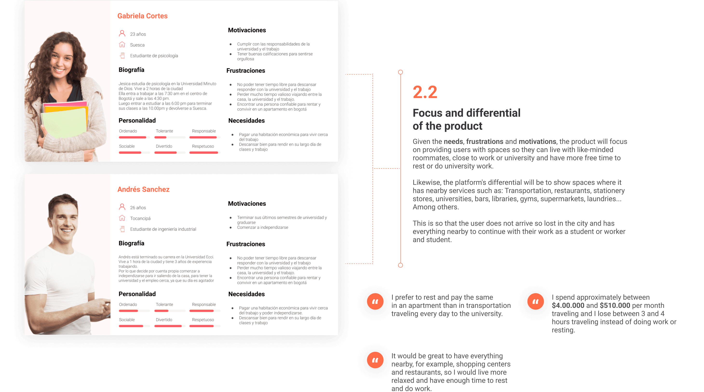
In this stage, we focused on defining the different user profiles of the product with the information from the surveys and interviews. Likewise, the approach and differentiation of the product were defined taking into account the needs and pain points identified.
Insights Benchmarking
This phase involved competitive benchmarking to identify market-leading solutions, best practices, and flow patterns. The insights gained will inform our product development, reduce the user learning curve, and enable us to create a differentiated value proposition.
Insight 1: After doing a general search of where I want to live, filters can be applied to the three products to refine the results. This is a common pattern. It is very good to be able to find apartments and roommates more to my tastes.
Insight 2: The space detail has the same information architecture in both of these products, therefore it is also a frequent pattern.
Insight 3: It is interesting to have a good profile of the roommate to know if it matches the user's tastes, most of the products could see these without becoming premium.
Insight 4: The column view and map view of the sites that are on offer is a repetitive pattern.
Insight 5: It is better to enter the login and account creation when we want to contact the roommate. Since if I see that I am interested in the roommate or the apartment, I create my account. Instead of creating it before to see if I am interested in the apartments.
Insight 6: I saw it as a good practice to request a chat from the roommate, this to know if he is really interested in sharing space with the user and at the same time is a patron.

Ideating Information architecture
After defining the product and its differential, the information architecture began to be designed so that the user could search, see the spaces, and then communicate with the roommate depending on the preference, so two paths were made: Contact requesting the phone number, and another to request the chat.
The site map was also made to define the MVP and understand the dimensions of the product for both the mobile application and the web platform.

Wireframes of the web platform
Following the definition of the Information Architecture (IA), we initiated the concept and visualization phase. This began with low-fidelity wireframes to visualize the core user flows across both web and mobile applications for Android.

Moodboard
In this instance, we also created a Moodboard to define the visual path of the product. For this, sites with branding closely related to what we wanted to convey in the product were sought. WeWork, Hubspot, and Airbnb were used as references.
So I started putting together a reference of illustration styles, and at the same time, I was looking for the ideal color palette and typography.
Finally, I decided to be guided by the style of photography used at WeWork, since the niche is focused on students, I wanted to give it a cool coworking environment so that users feel that it is an ideal space to live and study.

High fidelity
The design then progressed through rapid iteration to create high-fidelity mockups and interactive prototypes, all while integrating industry best practices and established design patterns identified during the competitive benchmarking phase.

Typography and Color palette
To ensure cross-platform visual consistency and brand alignment, Roboto was selected as the designated typeface for all elements across both the web and native mobile applications, standardizing the product's typography within the design system.

UI Components
I led the implementation of the Atomic Design framework to optimize development efficiency. In this phase, I focused on creating a reusable component library that streamlined the design process for future features, thereby reducing the design-to-development time and ensuring clear, efficient communication with the engineering team.

Usability Testing
Last but not least, we conducted a usability test to validate the flow ideas and learn from the way users interact with the product.
Hypothesis
Understand if users can communicate with each other on the request chat button on the space details page so they can rent it later.
Detect how users log in or register when they want to communicate and when they want to be a user of the platform on the main page.
Detect pain points when going premium once you log in to the plans page.
Observations
Observe if the user registers or logs in with Facebook or by form.
Observe if they communicate with the roommates from the chat or by going premium to request the number.
Observe what happens when the platform asks you to log in.
See if you see or notice the active status of notifications when you send the chat request.
Observe if they use filters and if so, what search filters do they use?
Task for the text
Task 1: Imagine that you live 2 and a half hours from your university. This is why you decide to move to a place that is closer to you to rent, you also want to have gyms nearby and you have a budget of $700,000. How would you find the ideal option?
Task 2: Imagine that you are interested in sharing a room with Luisa Sánchez. How would you start exploring?
Task 3: Imagine that ParceRoom was recommended to you to rent an apartment and you want to log in as a user. What would you do in that case?
Task 4: Imagine that you really like the platform and you realize that you can find the ideal space to live, but you ran out of the free version and want to pay for a plan. What would you do?
Usability Test Summary
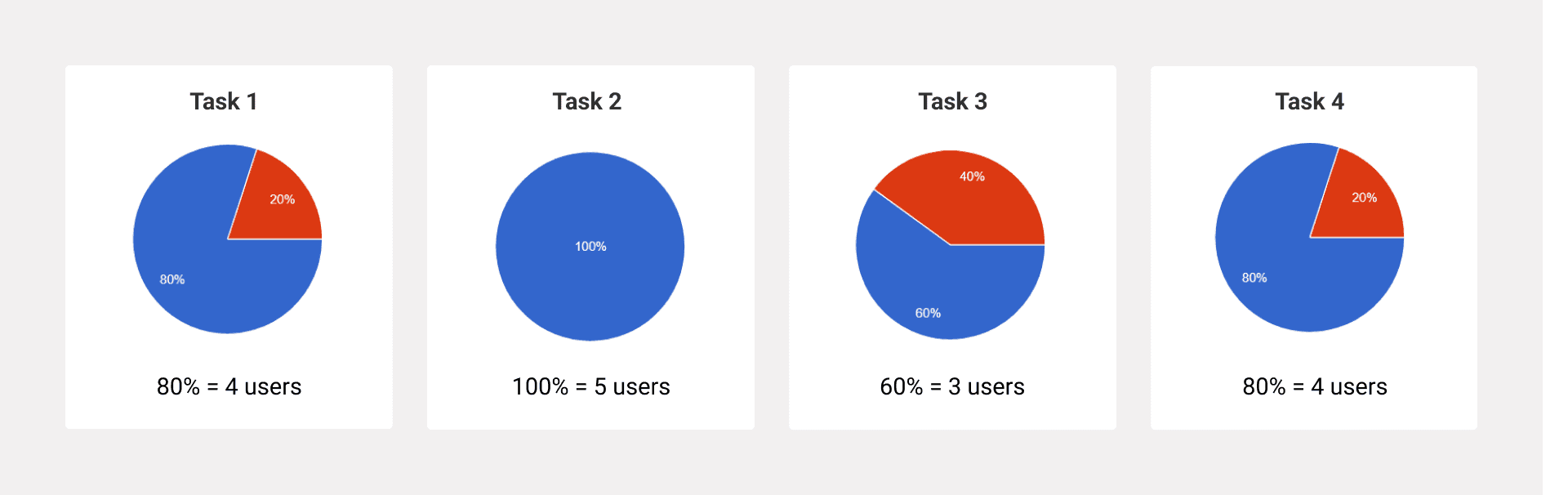
Participants: 5 users living on the outskirts of Bogotá who commute daily to the university.
Registration: 2 of 5 users registered via form; 3 via Facebook.
Communication: All users contacted roommates due to space details, not the roommate’s personal profile.
Filters: 3 of 5 users used the price filter; only 1 user used all three filters.
Membership Model: All users stated they would not pay a monthly membership but would pay if they found their ideal space.
Chat vs. Call: 3 users used chat; 2 requested the phone number. Interestingly, 2 users requested the chat after already having the phone number.
UI Issue: Users were confused by the chat illustration that didn’t display the roommate’s response.
Conclusions and Actionable Insights:
Simplify the Membership Flow:
Remove the “Become Premium” step in the phone number request flow—users are only willing to pay after finding a suitable space.
Equal Priority to Contact Options:
Provide equal prominence to “Request Chat” and “Request Phone Number” since users value both interaction types.Refine the Chat Experience:
Update or remove the chat illustration to display clear, responsive feedback from the roommate and reduce confusion.Optimize Filter Visibility:
Highlight and simplify filters—particularly the price filter—as it’s the most frequently used and relevant criterion for users.Reassess Profile Relevance:
Since users base their contact decision on space details rather than roommate profiles, prioritize improving space visuals and key details over profile personalization.