
Designing a Seamless Credit Card Acquisition Experience
Product Owners
Front/Back-End Developers,
UX Designer
UX Lead
Digital Marketing Leader
UX Designer: Aligned stakeholders, moderated workshops, ideated user flows, wireframes, and conducted competitive analysis.
User Researcher: Conducted user data analysis, developed and implemented usability testing methodologies.
UI Designer: Created Prototypes, Motion UI, and carried out Usability.
Context
Bancolombia is the largest and most influential bank in Colombia, serving a massive customer base. This project focused on optimizing the Credit Card Request Flow, a critical high-volume revenue funnel that introduces customers to the bank's extensive suite of financial products and benefits.
Problem:
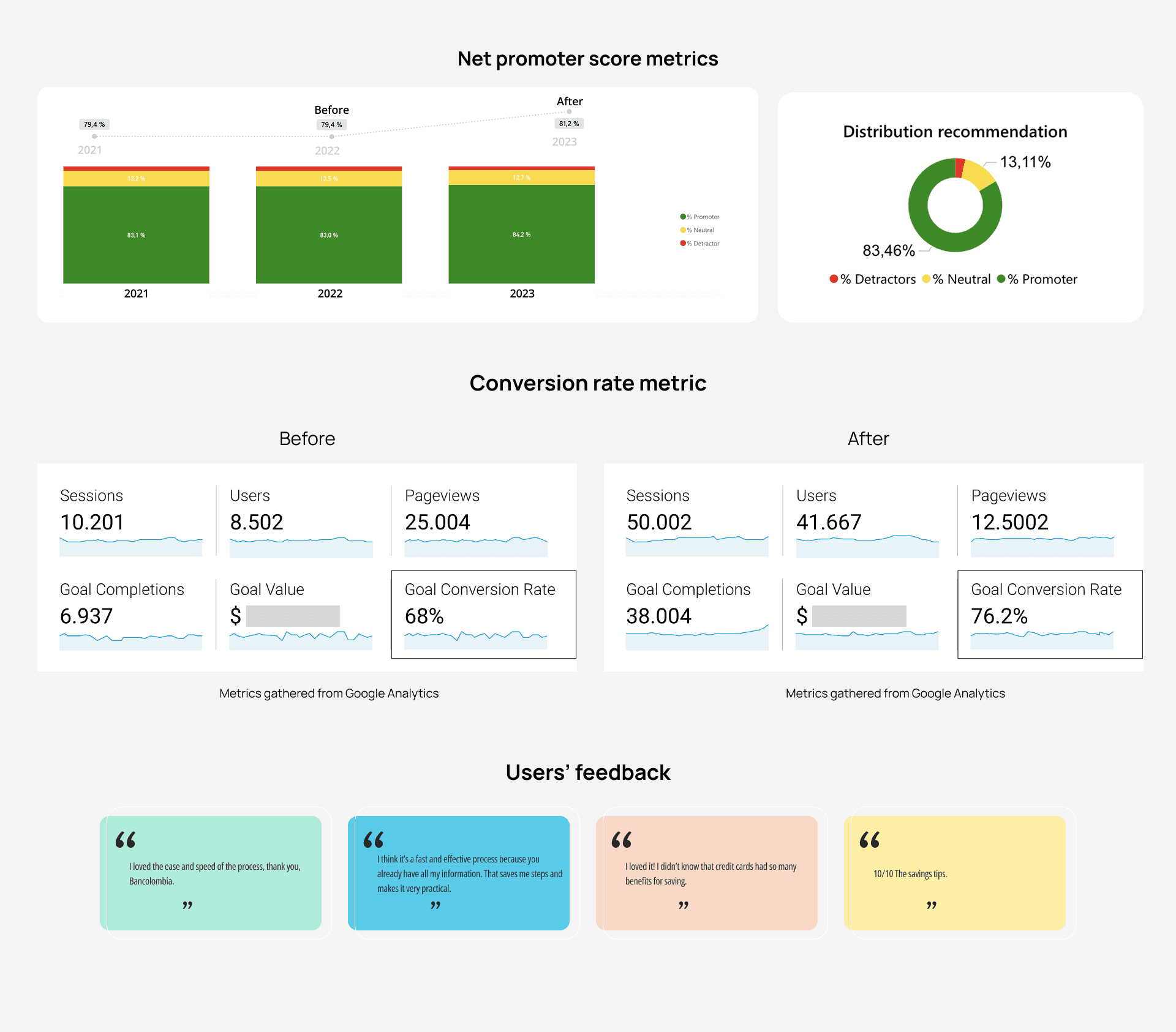
Despite high traffic, the Credit Card Request Flow had a 68% conversion rate. This means that these user flows had a potential opportunity to increase revenue and improve the user experience.
Objective:
Our primary objective was to increase the funnel conversion rate while enhancing the user experience, thereby transforming points of high friction into a smooth digital application journey.

The Design process
We synthesized the best UX methodologies to develop this tailored plan, considering the project's maturity and deadlines.

Evaluating the funnel conversion rate
I spearheaded the initial quantitative analysis of the funnel from a survey implemented previously. To minimize assumptions, this data and insights were used to formulate and testable hypotheses, ensuring our subsequent user research was strategically targeted to validate friction points.

Research strategy to tackle this challenge
Research objectives:
Identify Core Value Drivers: Map the customer's high-level "Jobs To Be Done" for credit card acquisition. Simultaneously, uncover key differentiating factors that make Bancolombia the preferred choice over competitors.
Painpoint and Validate Conversion Gaps: Specifically target and validate/invalidate the hypotheses formulated from the funnel analysis, focusing on cognitive and process friction that contributed to the abandonment of the experience.
Segmentation.
Strategy: Extremes and Successes. To generate the most actionable and contrastive insights, we purposefully sampled two extreme user groups based on their recent behavior within the last month.

Research artefact
Cognitive Walkthrough
This step-by-step observation identifies where and why users struggle (e.g., confusing forms, ambiguous language). It provides granular data to directly inform immediate usability improvements in the current user flow.
Semi-Structured Interviews
This flexible method is superior for uncovering the deeper emotional and social motivations (the "Why") behind a customer's decision. It allows the use of the "Switch" framework to effectively map the entire competitive landscape and understand why they ultimately "hired" Bancolombia over other options.
This instrument only covers the most meaningful insights. If you would like to delve deeper into the specifics, I would be pleased to elaborate during a scheduled discussion.

Results of the research:
I consolidate those insights in a kind of journey map to identify the key points to iterate on the funnel.
Key insights
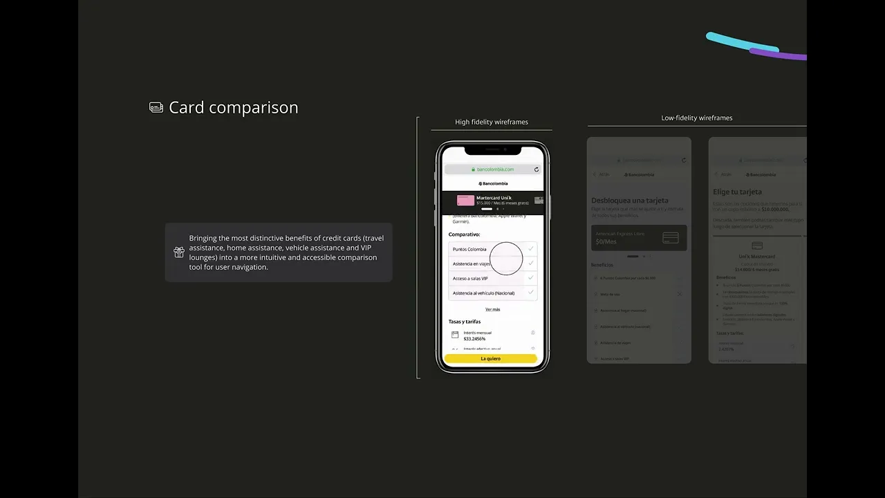
Insight 1 and 2: A significant 80% of users who abandoned the flow didn`t differentiate the benefits between the various credit card products due to poor UI/UX presentation. In addition to that, users feel overwhelmed because of the great variety of alternatives presented in credit card offerts.
Insight 4: The hypothesis regarding long flow (H2) was validated, as 80% of abandoning users explicitly cited the "extensive and overwhelming nature" of the forms as the primary reason for quitting the process.
Insight 5: 30% of users pointed out having overload time and technical issues in this step of the process. Which means that users try to get a credit card more than once, and some of them quit.
Cognitive Walkthrough of the Application Funnel: Insights and Friction Points
This map allowed us to come up with solutions for each insight through a workshop with cross-functional teams.
This, also provides a high-level overview of the truth. If you would like to delve deeper into the specifics, I would be pleased to elaborate during a scheduled discussion.

User flows
We bring our solutions to life in a user flow, considering the action points proposed in the workshop through the map.
Action points:
The visual design and information architecture are failing to highlight the key differentiating factors that make Bancolombia the preferred choice (as per Objective 1). The redesign must prioritize clear product comparison and benefit communication.
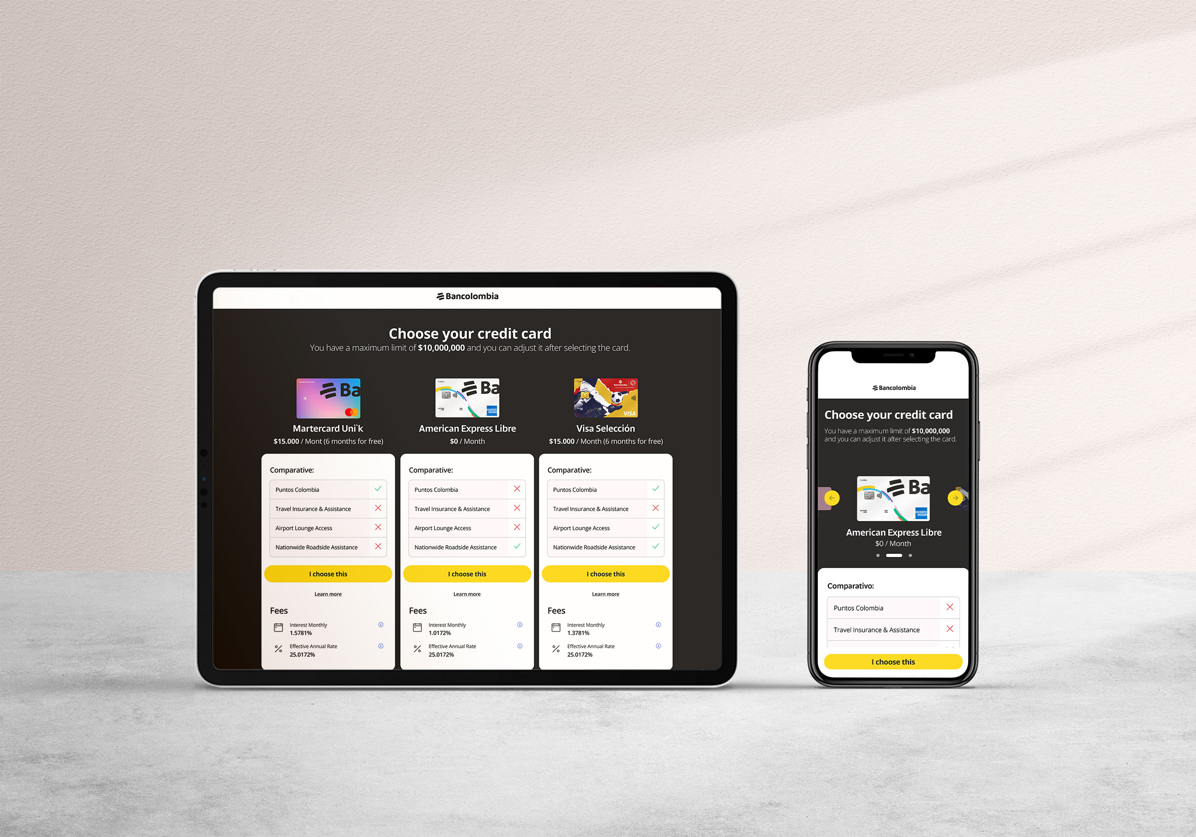
Present the best three alternatives in line with their finance behaviour and lifestyle.
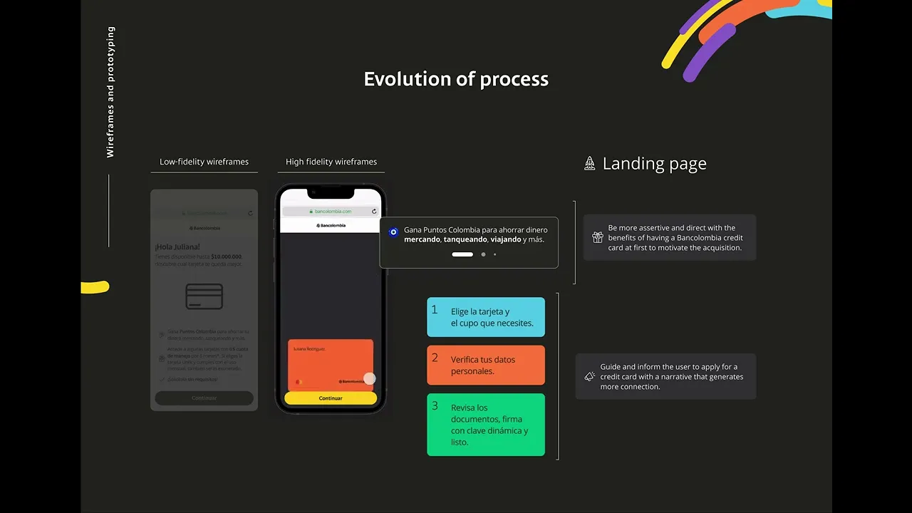
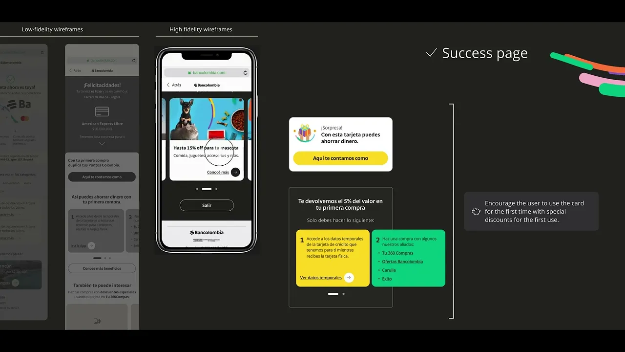
Highlight the most remarkable benefits of Bancolombia's credit cards in marketing pieces, landing page and loaders.
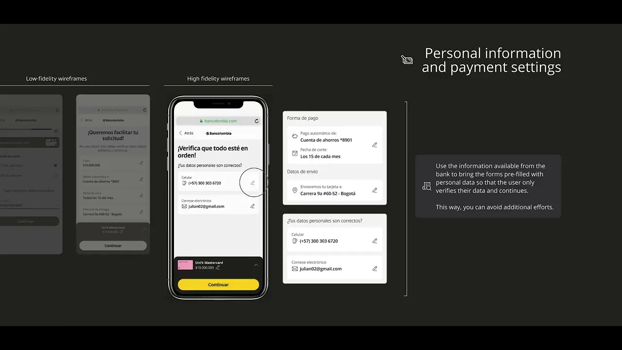
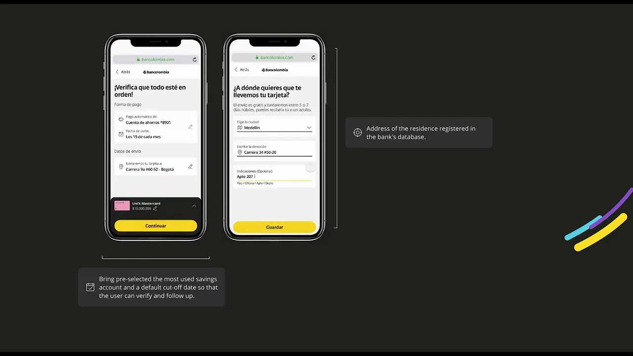
Action points: The solution must focus on form consolidation, visual simplification, and reducing the perceived length of the process by using data already collected in the bank’s database.
Action points:
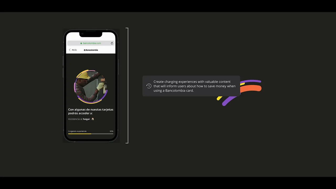
Execute a comprehensive technical review with the developtment team throughout the flow to cover downtimes scenarios with content value.
Design loaders screens to provide value content regarding Bancolombia´s credit card benefits in overload scenarios.

Prototyping the action points
Here, we took into account the same premises and action points identified in the research phase for the redesign, which we implemented using a mobile-first approach.
During this process I mainly use the following concepts:
Hick's Law and the Aesthetic-Usability Effect to simplify form steps by pree filling forms and clearly highlight the card's full benefit structure, directly tackling the high abandonment rate.
To minimize user effort and maximize flow speed, we designed the data confirmation screen using Fitts's Law. The primary action buttons ('Continue' and 'Edit') were strategically enlarged and optimally positioned to reduce movement time, allowing users to quickly verify their information and proceed to the next step
Desktop version
Once the core mobile hierarchy was established, the desktop version was designed to fully leverage the increased screen real estate. This allowed us to introduce visual segmentation and persistent navigational elements to clearly surface all previously hidden benefits and contractual information, ensuring users had full clarity without cognitive overload

Validating the solutions
We then validated our solution through a usability test. In this instance, we had the support of another UX designer, who joined the team during this phase, and together we designed the protocol to test our experience with real users.
1: We define the objective
Evaluate the level of usability of the experience and the understanding of the content.
2: We choose the methodologies
Usability testing: Focused on observing users interacting with prototypes to pinpoint process friction and cognitive overload (H2), ensuring the redesigned flow was effortless and clear.
A/B Testing: To reduce friction and effort, we A/B tested the credit card limit input method, comparing the Slider Toggle (Test A) against the Text Input Field (Test B). This ensured our final design choice was validated by data for superior usability.
3: Archetypes to apply the study
2 beginner: Users with no prior credit card experience who are starting the application process for the first time. Their primary need is education and trust.
2 intermediate: Users with 1-2 years of credit card experience who understand basic usage but fail to fully utilize available benefits.
2 experts: Users with 3+ years of experience who actively use cards daily and leverage advanced benefits and rewards.
This validation doesn't cover the results and the iteration. If you would like to delve deeper into the specifics, I would be pleased to elaborate during a scheduled discussion.

Success Metrics and User Feedback
Contributed to a 6% increase in credit card applications and improved NPS to 83,46% by leading an end-to-end UX design process. This involved analyzing the conversion funnel to identify key UX pain points, conducting competitive research, and facilitating user testing to validate solutions. Collaborated with cross-functional teams to develop and iterate on user flows, wireframes, and prototypes, ensuring data-driven improvements that enhanced the user experience.
The obstacle in the way is the way." We turned long loading screens into a strategic opportunity, delivering valuable content that educates users and motivates them to save money with Bancolombia Credit Cards, effectively closing a key experience gap.
At times, focusing solely on creating 'short experiences' can backfire, as it may result in an overly saturated experience and lead to excessive cognitive load. We've learned to approach this with caution, staying mindful of the delicate balance between engagement and simplicity.
To perform more effectively under pressure and with limited time, leverage the resources and tools available to maximize efficiency and outcomes.